Overview
My Role
I was Principal Designer in charge of designing both iOS and Android apps. I designed all aspects of the app, including: visual design, color schemes, type scale, component design, user flows, and documentation. In addition, I formed a partnership with the head of product, head of iOS development, and head of Android development, which opened up a healthy communication channel that benefited everyone.
Approach
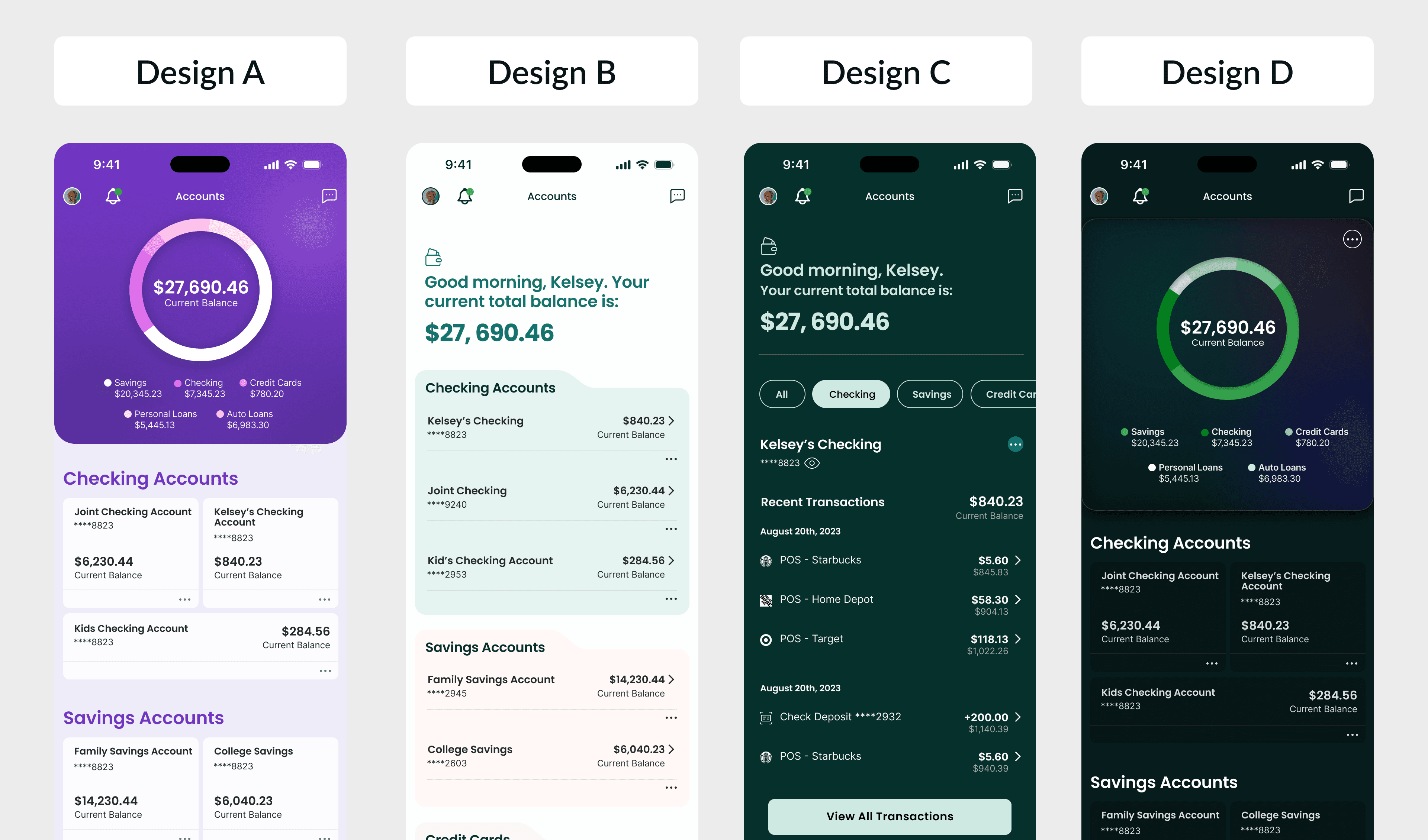
Since our goal was to create a completely new design system, after interviewing key stakeholders around the company, including C-Suite, and Dev leads, I started the project out by designing aspirational concepts to showcase what our app could look like, and to eventually be used as a north star to guide our design decisions.
Preference Testing
After creating design concepts, I wanted to gauge user feedback to see how our customers responded to the various options. I value user feedback, and never think we should design in a bubble. So I partnered with research team to run impression tests with over 100 of our customers.
Navigation Patterns
After determining a visual direction to go in, it was time to get to work on actually defining how users will interact with the app, as well as decide which features and services would be most prominent in the app. I worked with a small team of stakeholders to establish core navigation patterns and principles that would be used throughout the app. I then created a fully interactive prototype in Figma for testing.
Color System
With the new system I created mappings for both light and dark modes using Figma tokens. I created one color palette that could be shared between iOS & Web, and a second for Android with mappings specific to Material 3.
Complicating things was the marketing teams requirement that we stick with the brand purple as the primary color, which is not a shade that lends itself well to digital design due to contrast issues in certain scenarios. So I had to overcome that particular challenge when creating the visual design style.
Figma Components
I also built out every component needed for the new design system in Figma. There was a strong desire from the Dev leads to use as many native iOS & Android components as possible to ease the Dev lift. I obliged their request and began choosing components from both iOS 17 & Material 3 libraries that would fulfill our needs. However, I still had to create many custom components to accomplish our objectives.
As each component design was complete, I added them to a style guide and documented parameters and usage for hand off.
Features & User Flows
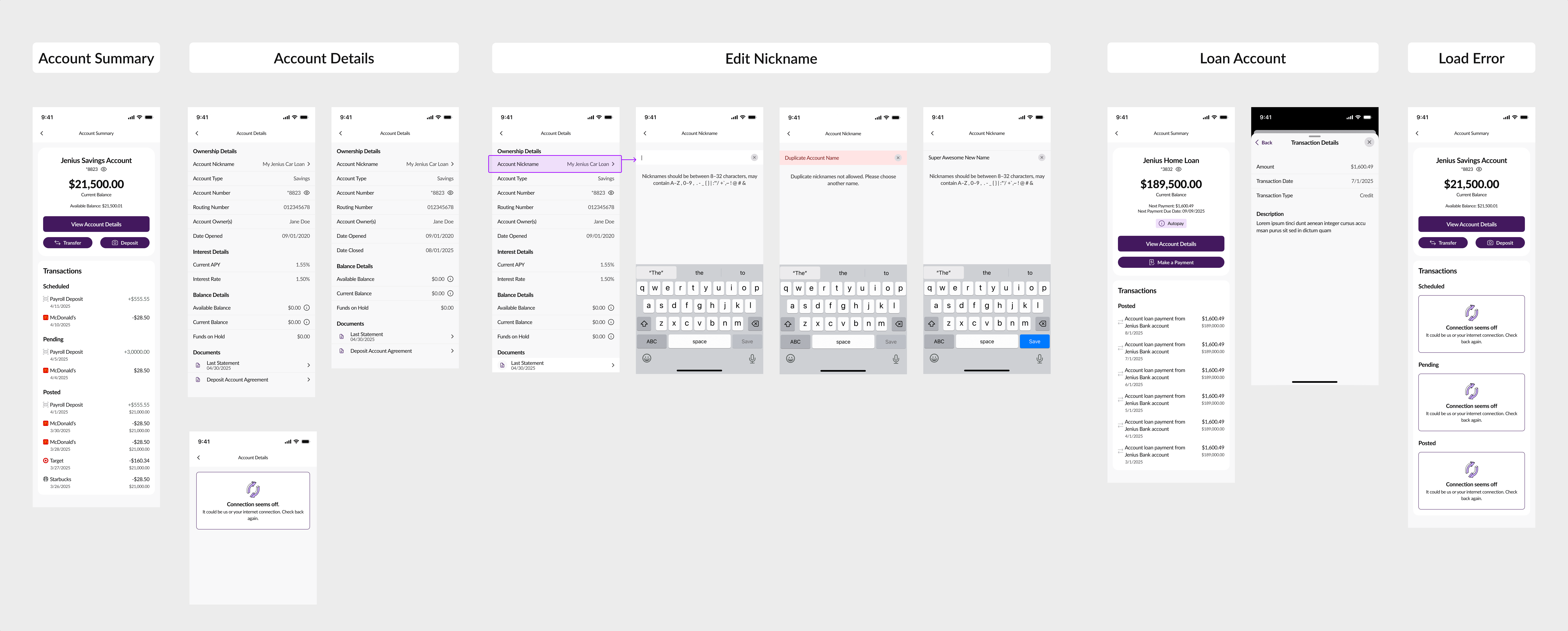
After the components were built and everything was documented for the Devs, we were finally ready to build out the application. I partnered with subject matter experts for every feature of the app to build out flows, first in wire frame mode, then converting the wire frames over to high fidelity using the new design system.
Data Visualization
Unfortunately, in order to hit our target release date, we initially had to use MX's default graph style. A major upgrade for 2026 is to natively create all graphs throughout the app using Swift charts on iOS, and Jetpack Compose charts on Android.

Design Examples
A few examples of designs that were either produced, or in process.


